But what will I wear?!?
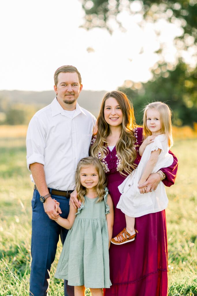
Paden and I scheduled a family session with a dear photographer friend of mine last fall, and let me tell you, there was nothing more stressful than coordinating our outfits before the shoot. His shirt was white, so mine needed color, but Reese’s dress needed to coordinate with my dress, and Hollyn’s dress needed to coordinate with Paden’s shirt. But what about Paden’s pants? Should he wear jeans, khakis, or shorts maybe? It felt like there were so many options, and it just becomes an overwhelming jumbled up mess in my head! As a photographer, I see a lot of different clothing combinations from clients. I see a lot of matching outfits, color themes, everyone in jeans, everyone wearing their best church clothes, and sometimes, no coordination at all. If you have a photoshoot coming up and you are filled with dread about it, merely because you don’t even know where to begin with your outfits, you have come to the right place! I am here to help you represent your family well, and look your best for your upcoming shoot.
Matching outfits
I am just going to say it and get it over with, matching outfits just aren’t “it.” I remember growing up and going to the local photo studio with my family. We would usually where the same color, red, and white, or our entire outfits would just be denim. A denim shirt, shorts, you name it. Or we would go to the beach and the color chosen for that year would be navy blue. I would be searching my closet for anything I owned in that color, we would do beach photos and every single one of us would have the same shade of blue. Although wearing the same color as your mom during a photoshoot was trending back in 2003, it’s out now. I know it’s the easier option. Pick a color, announce the color, everyone shows up in the color, take photos, go eat afterwards. No. Don’t do it. Why you ask? Because first off, how boring! You all just blend in and look the same! Same color, different face. Your photos lack uniqueness, and honestly, most people within your family are probably not even wearing something they would typically wear on a daily basis, or something they even like, because they were just too worried about trying to find a piece of clothing in the exact color shade you all agreed upon. If this was your go-to plan before stumbling upon this blog post, don’t stress! I am going to help you make a new plan.
Coordinating Outfits
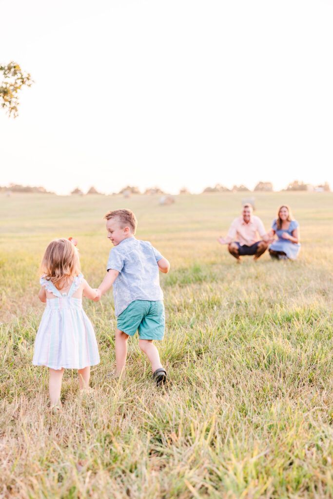
It’s 2023, which means times have changed. Color coordination is in, and matchy-matchy color themes are out. This may sound overwhelming at first, but it really doesn’t have to be! When I scheduled our own personal photo session last year, I first went to Pinterest. I typed “family photo color themes” into the Pinterest search bar, and it brought up an abundance of different color combinations for families! I would HIGHLY suggest utilizing Pinterest for inspiration, they have so many color themes to choose from. I had multiple color themes I loved, but once I narrowed it down to one specific theme, it was time to start shopping and digging through closets. It’s very important that you have at least 3-4 different colors within your theme. For example, this beautiful family I photographed just a few days ago absolutely nailed it when it came to their outfit coordination. Their main color theme was white, light pink, light blue, and a turquoise green shade.
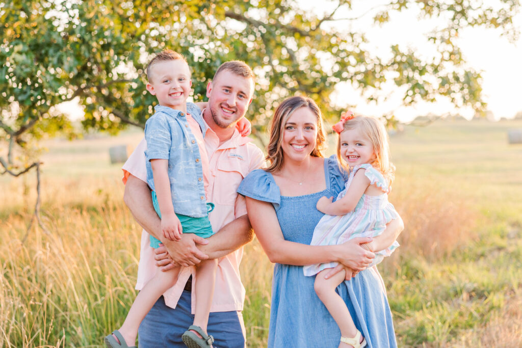
Now let’s analyze these outfits for a moment. Dad has a pink shirt, and the son also has a pink shirt, but to make sure they wouldn’t clash, the son also has a blue shirt over the pink shirt. But wait, there’s more! The son’s blue shirt helped to tie in moms outfit, which was a solid blue dress. So at this point, this cute little boy is now wearing a matching shade from Dad, and a matching shade from Mom. The little girl has three colors within her dress; light blue (matching Mom), light pink (matching Dad), and that unique turquoise green color (matching brother’s shorts). THIS is a perfect example of color coordination! They are wearing the same colors, but they aren’t all wearing a boring light pink shirt. They have three main colors instead of one main color, which makes their outfits unique and fu, while each outfit compliments someone else’s. Making more sense now?
Solids and Patterns
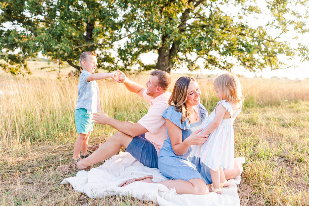
Lets’ talk about solids and patterns. We have learned how important it is that everyone in your group doesn’t just wear one solid color, but what about everyone with different solid colors that coordinate? I think at this point, it’s preference. Let’s use this gorgeous family for another example. Mom, Dad and brother all wore (mostly) solids, but sister’s dress was a cute striped pattern. I personally think her dress tied everything together. The pattern wasn’t obnoxious, but it was fun and represented that cute little princess well! The little boys light blue shirt also had a subtle pattern, but honestly, you would have to look extremely close to even notice the white palm tree’s and dinosaurs on his light blue shirt! The shirt represents him well, it’s fun, and perfect for a little boy his age, but it’s not obnoxious! The dinosaurs and palm trees are a neutral white color, which ties in the white from the little girls dress too. Would we even notice this if we weren’t analyzing this photo? Probably not. But if the dinosaurs on his shirt were a bright orange or bright purple would we notice? Absolutely. It would completely ruin their perfect color theme! If the little girls dress would have been a solid pink or blue color would it have been okay? This question is tricky. Personally, I think yes, but it would have been a slight issue while posing this family. If she had on a solid light pink shirt like Dad, I would have made sure she wasn’t next to Dad for the group photos, because their outfits would have clashed, and if she does better with Dad holding her, this could cause some issues. Or if this family would have wanted a portrait of just her and Dad, then they both would have had light pink on. Would it have been the end of the world? No! But it wouldn’t have looked near as visually appealing as Dad in a solid pink shirt, and her in a striped dress.
Shades and Colors
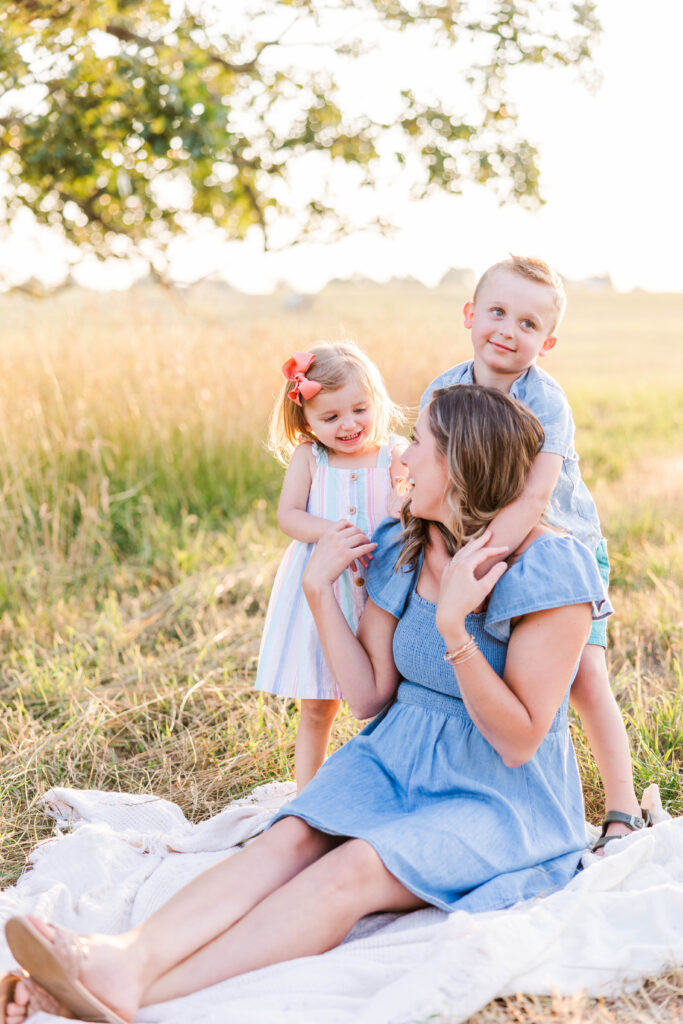
Choosing the correct shades and colors based on the photographers editing style is so important. If you follow me on any social media platforms, you know that I shoot very bright and airy, therefore, brighter and lighter colors just look better with my style. If you have a photoshoot coming up with a photographer that edits dark and moody, I would suggest wearing darker colors. Can you also wear darker colors with my style of editing? Absolutely! But I truly think lighter colors will compliment my photos and editing style better. When I say lighter, I don’t mean neon colors, though. Whatever you do, DO NOT, and I repeat, DO NOT wear a neon shirt to your photoshoot. I mean lighter shades, whites, khakis, etc. Even a pair of jeans with a lighter colored shirt is perfect. Your entire outfit doesn’t need to be a lighter shade, but it will look best if at least 75% of it is a lighter shade.
Don’t Stress
Last but not least, don’t stress over this! My best advice to you is pick a color scheme first, then, choose a member of your family, and put their outfit together before anyone else’s. After that, base everyone else’s outfits off of that first outfit. If you need to switch an outfit up or add or take away something, that is totally okay. Just trust the process! Also, if you were to all show up to the shoot wearing all red, you do you! Just because this is my opinion, doesn’t mean it has to be yours. At the end of the day, these are your family photos, and I am here to support you and capture your family on camera no matter what you are wearing! Outfits are just material things, family is everything. If all else fails, lay out your outfits on your couch side by side, look at them next to one another and make sure the colors tie together well. Feel free to send a photo of the clothes to your photographer and ask their opinion. Many of my clients have sent me photos of their outfits laid out on the couch or even the floor before their shoot, and I am always happy to help!
Much love,
Ashton Turnbull